Imagine being the first website who used a beautiful shot across their landing page with a smart statement and a button to click. What a thing to put on your resume. It was so good, in fact, that people all across the world started stealing the idea. In just a few short years, everybody and their uncle started using their own version to drive sales.
There is only one problem. Its beauty makes it appealing to use but it has no integrated information flow. There is no guidance and no strategy behind it. All you do is fill predesigned boxes with content. It's as shallow as the stock images you'll have to replace.
The great deception of a "simple" website is its beauty when you show it to your friends. They will tell you it's great because they are familiar with your business. What you'll never see is how confusing your website might be to people who visit you for the first time. You'll never hear about their irritation or your lost sales.
But your website continues to lie to you, looking great and costing you a lot of sales.

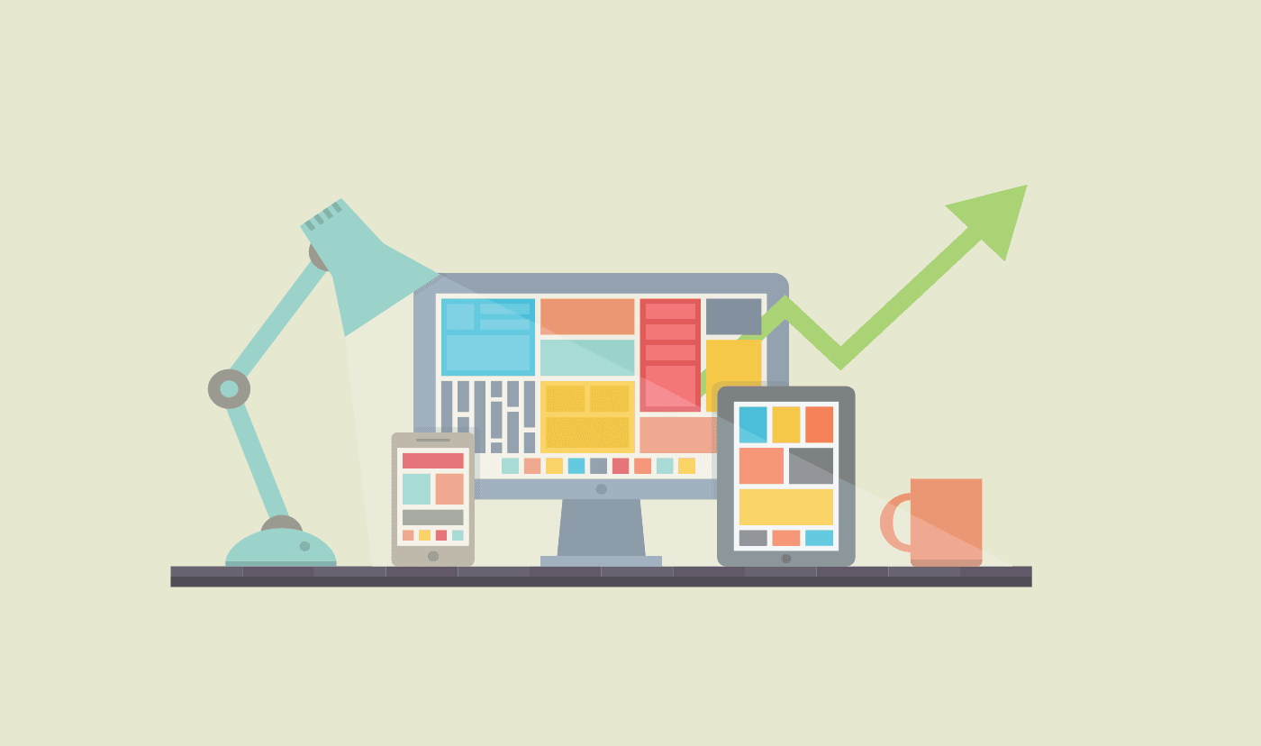
Layout Hacks for clarity
Aesthetics is an important part of the website. It's the first thing your visitors see, it's creating emotions, nudging and impacting.
But creating a communicating, sales-driven website seems like a black box. You put your ingredients in, some designer waves their m agic wand and poof – you have a thought out layout. Even though it helps to have an artistic eye, there are a basic set of principles that will help you to design a website for clarity and success.
Our goal here is not to turn you into a designer. But we do want to give you a few pointers that will help you to make your website more functional and enjoyable for your readers. This will be especially helpful if you work with a template. They look great when you start working with them but they tend to lose their style over time.
Let's take a peek at the black box together and see what's happening inside.
Guiding the eyes
Throughout your website, you have to take your visitors by the hand and point them towards what's important. Visual cues that say 'hey, how about that?' or elements strategically placed that peak a person's interest.
We can use text, images, and even whole sections of your website. It's about positioning the different elements of your website in a way that directs what you see first, second and so on. Look how Netflix does that in the image below.
Your eye will read the header first, then move on to the big, red signup button and then read the smaller text. It catches your attention(1), throws the offer at you(2) and supports the claim(3).

Call to action
Every website has reason to exist. There are things you want people to read and content you want them to see. But in the end, you want them to take a certain action. That could be signing up for a newsletter, downloading a white paper or buying a product.
Everything on a page should serve the completion of your call-to-action (CTA). This includes the visual importance you have to place on it. It has to be distinguished against the rest of the design. Never make it blend in with your design or look equal to other elements.
Netflix does a great job with the background graphic on that. You can see all the titles shine though but they are overlaid with an opaque black that makes the CTA button pop. It gives it a nice effect but their nudge is clear. Sign up now, please!
AWeber does the same thing on their website. They have a screenshot of their app and a few playful but very toned graphics. The main CTA is for the visitor to sign up for their trial. They use a completely different color from the background to make it the focal point.

Contrast
The high distinction between elements is not only important for your CTA but for your entire website. Don't let beauty overrule clarity. It will confuse the reader and add a barrier between your content and their understanding. If in doubt, check your pairing here.
Make sure your text on your images is always readable. If it's not, consider putting a dark box behind the text or darkening the image. That can also be helpful if you're dealing with an image that has a lot of colors. You can also use this tool to see which text works best for your image.
Bonus tip: Never use complete black as your text color. Make it a little lighter, even on white background. It's less aggressive and pleasing on the eyes.
Make it skimmable
We're sure you've read the articles. People don't read the web. They skim. With so much information out there, we had to become very good at filtering out the information and moving on to the next action. It's about absorbing as much as we can in as little time as possible.
We don't want our website to stand in the way. We want to make it as easy as possible to extract the information they need.
Take a look at Business Insider. Like a lot of other news outlets, they have perfected the art of making skimmable content. They have a clear headline and the two main pieces of information as bullets beneath it. If you still want to know more, you can click on the Read More Button. And check out the other headlines underneath it. Maybe you'd like to read one of those?

For a regular website, we can use similar principles. Use subheaders for all of your large chunks of texts. Never rattle on and on without giving your reader a place to take a break. Subheaders are orientation points for what's about to come.
Also, make sure to use enough white (or empty) space. It's not only functional but also serves to declutter the space. It will create a better reading flow and make the whole experience more intuitive and therefore more enjoyable. If you're in doubt about white space, always go for more. It's more forgiving then too little.
Want to learn more?
All of these principles are based on a subset of web design called UI/UX, or user interface and user experience. Its goal is to eliminate all the barriers between the visitors and their goals. It's designed with a purpose to guide, not just to make things pleasing for the eyes.
All websites that tend to just work – you know, the ones you just 'get' – have these principles built into them. The beauty of them is that you can't tell they are there. And that's what makes the website so great. It looks so simple that you can't tell the amount of work it took to create.
Use these techniques on your website and your visitors will feel more receptive towards your goals.
Published with StoryChief